Customizing color themes
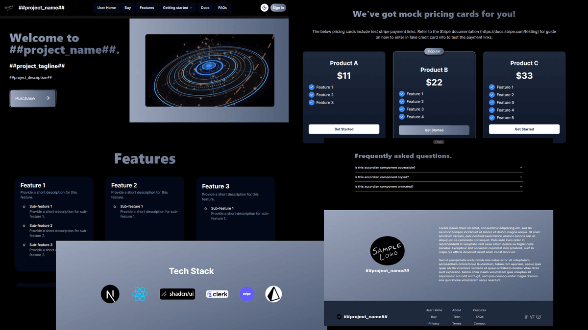
The SaaS World starter kit includes a variety of interchangeable themes that allow you to easily customize the visual appearance of your application.
By replacing the existing HCL color codes in the app/globals.css file, you can apply any of the provided themes to your project.
In addition to using the provided themes, you can create your own custom theme by specifying the HSL color codes for a unique set of colors. This allows you to align the theme with the branding of your project. To find the HSL color codes for various colors, refer to the various tools available on the internet.
Pick any of the themes below or a custom set of colors and replace the existing values of the following variables in the app/globals.css file.
gradient-from-color
gradient-to-color
gradient-hover-from-color
gradient-hover-to-color
Provided themes
- Default
- Royal
- Dragonfruit
- Flame
- Ocean
- Night
- Sunrise
- Forest
Color Codes for the provided themes
Each theme has its own set of gradient HCL color codes. These codes define the primary and secondary gradient colors for the theme, as well as the hover states.
Default
--gradient-from-color: 221, 19%, 67%;
--gradient-to-color: 219, 20%, 39%;
--gradient-hover-from-color: 221, 23%, 74%;
--gradient-hover-to-color: 220, 17%, 48%;
Dark Mode

Light Mode

Royal
--gradient-from-color: 209, 82%, 49%;
--gradient-to-color: 260, 98%, 52%;
--gradient-hover-from-color: 209, 87%, 55%;
--gradient-hover-to-color: 260, 99%, 57%;
Dark Mode

Light Mode

Dragonfruit
--gradient-from-color: 327, 100%, 40%;
--gradient-to-color: 263, 66%, 48%;
--gradient-hover-from-color: 327, 59%, 53%;
--gradient-hover-to-color: 263, 62%, 57%;
Dark Mode

Light Mode

Flame
--gradient-from-color: 35, 100%, 50%;
--gradient-to-color: 0, 54%, 34%;
--gradient-hover-from-color: 35, 99%, 60%;
--gradient-hover-to-color: 0, 100%, 33%;
Dark Mode

Light Mode

Ocean
--gradient-from-color: 200, 100%, 36%;
--gradient-to-color: 186, 100%, 34%;
--gradient-hover-from-color: 200, 96%, 40%;
--gradient-hover-to-color: 186, 97%, 37%;
Dark Mode

Light Mode

Night
--gradient-from-color: 253, 100%, 51%;
--gradient-to-color: 232, 100%, 59%;
--gradient-hover-from-color: 253, 97%, 53%;
--gradient-hover-to-color: 232, 100%, 62%;
Dark Mode

Light Mode

Sunrise
--gradient-from-color: 45, 100%, 45%;
--gradient-to-color: 24, 100%, 47%;
--gradient-hover-from-color: 45, 96%, 49%;
--gradient-hover-to-color: 23, 96%, 52%;
Dark Mode

Light Mode

Forest
--gradient-from-color: 99, 87%, 31%;
--gradient-to-color: 181, 100%, 19%;
--gradient-hover-from-color: 99, 81%, 33%;
--gradient-hover-to-color: 181, 91%, 27%;
Dark Mode

Light Mode

Conclusion
By following these steps, you can easily customize the theme of your SaaS World starter kit to match your desired aesthetic.
Whether you prefer any of the provided themes or a custom theme, simply replacing the HSL codes in the app/globals.css file allows you to instantly update the look and feel of your application.